ChatEase
A mobile app designed to connect you with friends and family through secure messaging, voice, and video calls

Overview
I started this project inspired by the need to simplify the registration process for new users in our app. The goal was to create a seamless and intuitive onboarding experience that minimizes user frustration and maximizes engagement. By focusing on user-friendly design and efficient flow, I aimed to ensure that new users can easily complete the registration process, paving the way for a positive first impression and long-term app usage.
Goals
The primary goal of this project was to develop an end-to-end registration flow that is straightforward and user-centric. This includes designing each step of the process, from entering a mobile number to verifying it with an OTP, and ultimately welcoming the user to the app's home screen. By doing so, I aimed to reduce drop-off rates during registration and enhance the overall user experience.
Problem
New users often face difficulties during the registration process, leading to frustration and potential abandonment of the app. Complicated steps, unclear instructions, and verification issues are common pain points. Addressing these problems was crucial to ensure that users have a smooth and positive onboarding experience, which is vital for retaining users and encouraging active engagement with the app.
Impacts
Through this project, I meticulously analyzed the registration flow, identified key issues, and implemented a streamlined, user-friendly process. My efforts resulted in a registration experience that is both efficient and enjoyable, significantly reducing user drop-off rates. By enhancing the onboarding process, I contributed to the overall success of the app, ensuring that new users have a seamless start and are more likely to become long-term, active users.
Research
Research Goals
Below are the areas I'd like to explore during the user research. I want to understand:
- The challenges users face during the registration process.
- The common points of confusion or frustration in the onboarding flow.
- The features or steps users find most intuitive and user-friendly.
- The overall user sentiment and satisfaction with the registration experience.
Competitive Research
For this part of the project, I decided to explore top-rated apps for user registration processes and compare key features to see what problems they address. I discovered that many apps offer streamlined registration flows but often miss out on addressing specific user needs such as clear instructions and efficient verification processes. By understanding these gaps, I aimed to design a registration flow that not only simplifies the process but also enhances user satisfaction. The insights gathered from this analysis and user interviews confirmed the importance of a seamless and intuitive onboarding experience.
User Interviews
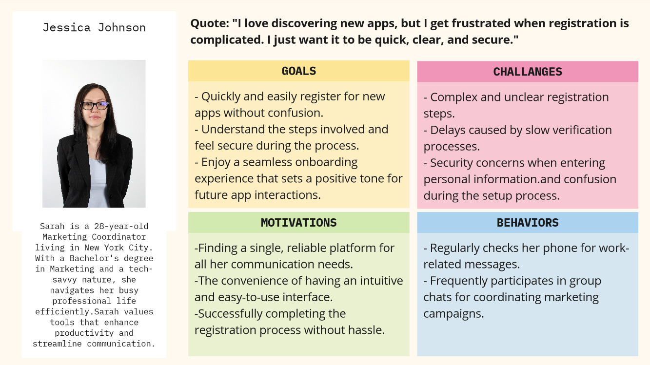
Through a series of user interviews, I discovered that the registration process often confuses and frustrates new users, leading to a significant drop-off rate. Many users expressed that unclear instructions and complex steps were major pain points. Additionally, users highlighted the importance of a quick and secure verification process, which many found to be lacking in other apps. These insights were instrumental in shaping the design of a more intuitive and user-friendly registration flow.
The feedback from these interviews confirmed the need for a streamlined onboarding experience. By addressing the issues identified, I aimed to create a registration process that is both efficient and satisfying for users. The new design focuses on clear instructions, easy navigation, and a quick verification system, ensuring that users can complete the process smoothly and confidently. This pivot in design strategy was essential in improving user engagement and reducing abandonment rates during registration.
User Flow
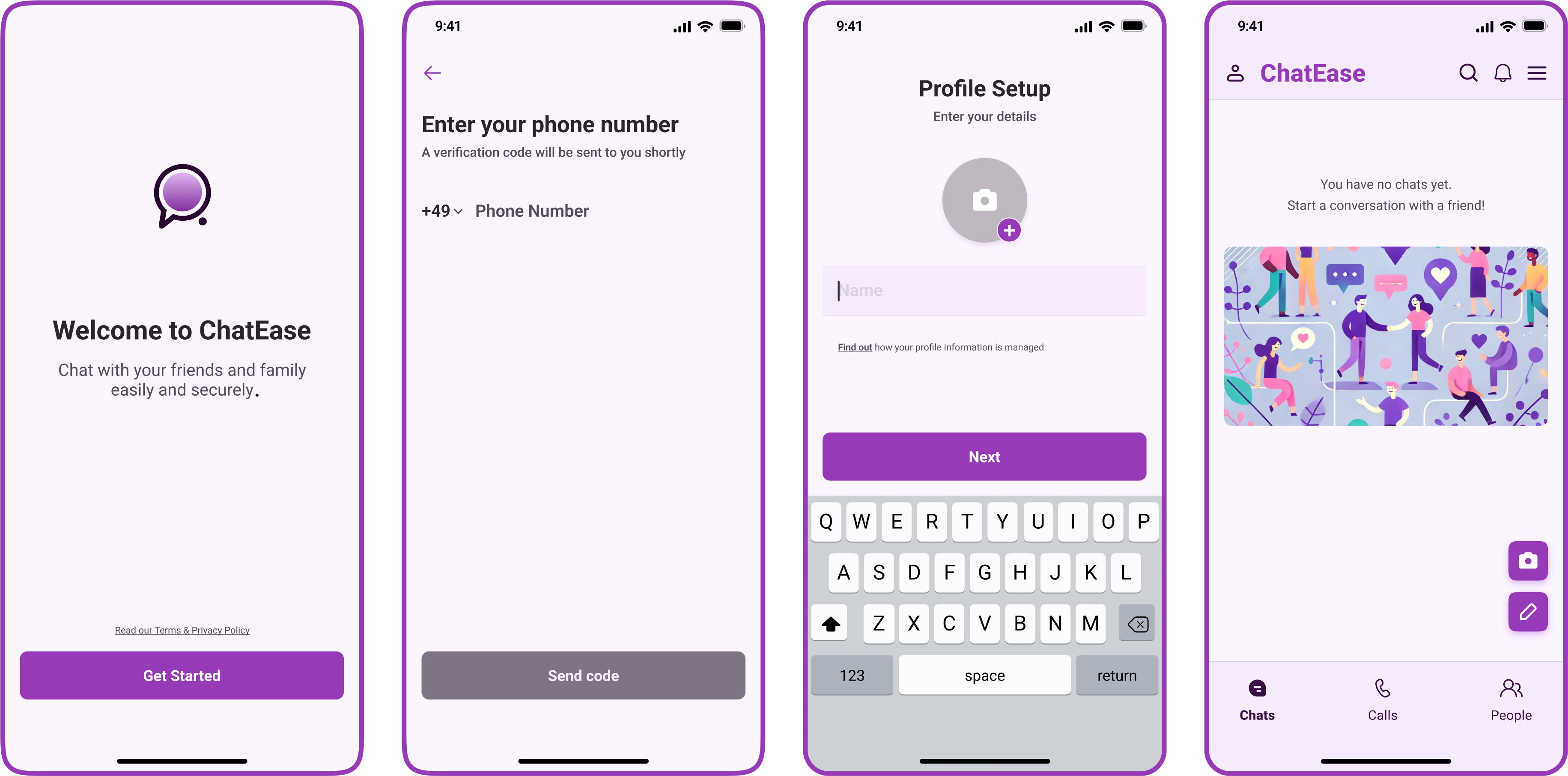
After defining the essential features of our app, I created a comprehensive user flow for the registration process. This flow guides new users through each step, from entering their mobile number to verifying it with an OTP and finally accessing the home screen. The goal is to ensure a smooth and intuitive onboarding experience, minimizing any potential friction and helping users quickly get started with the app. By focusing on clarity and simplicity, this user flow aims to enhance user satisfaction and reduce drop-off rates during the registration process.

Wireframes, Prototype and Testing
Lo-fi Wireframe
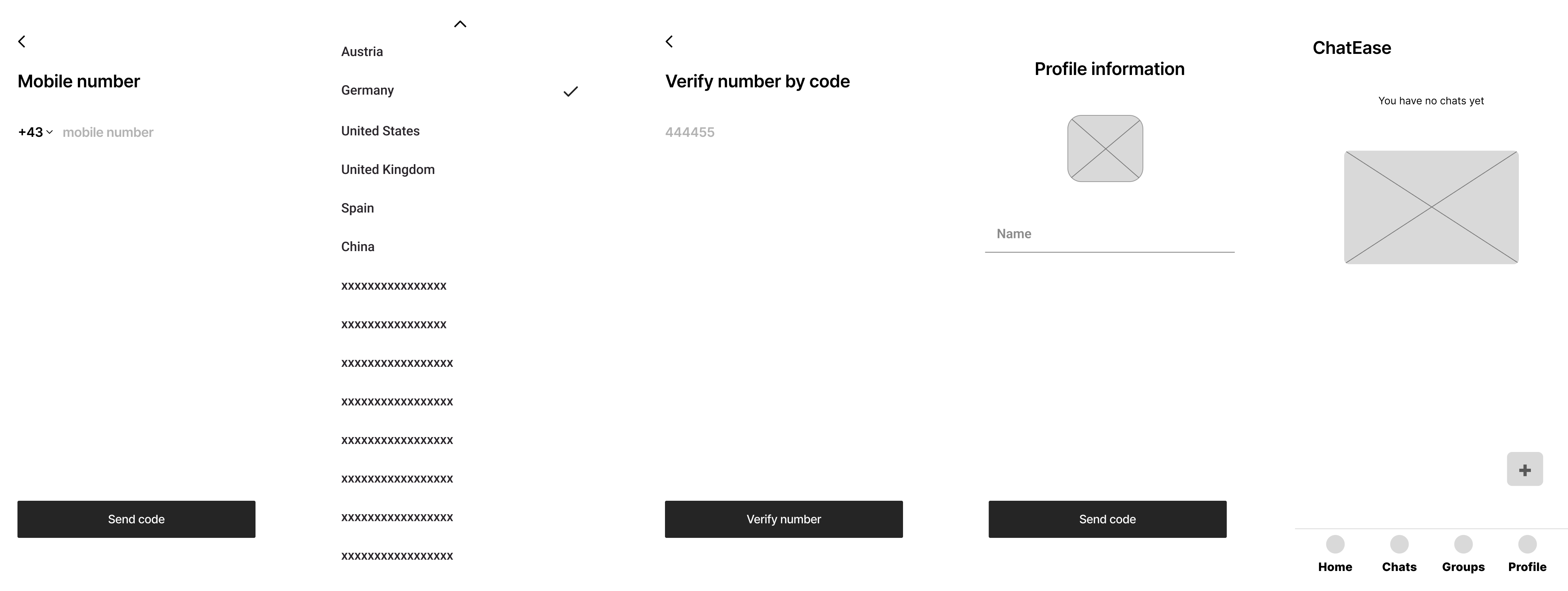
To visualize the user flow and ensure a seamless registration process, I created low-fidelity wireframes. These wireframes serve as the blueprint for the app’s onboarding experience, detailing each step from mobile number entry to OTP verification and successful login. By focusing on the core elements and interactions, these initial sketches allow for quick iterations and feedback, helping to refine the design before moving to high-fidelity prototypes. The goal is to create a user-friendly and intuitive registration process that sets a positive tone for the entire app experience.

Design Elements and Style Guide
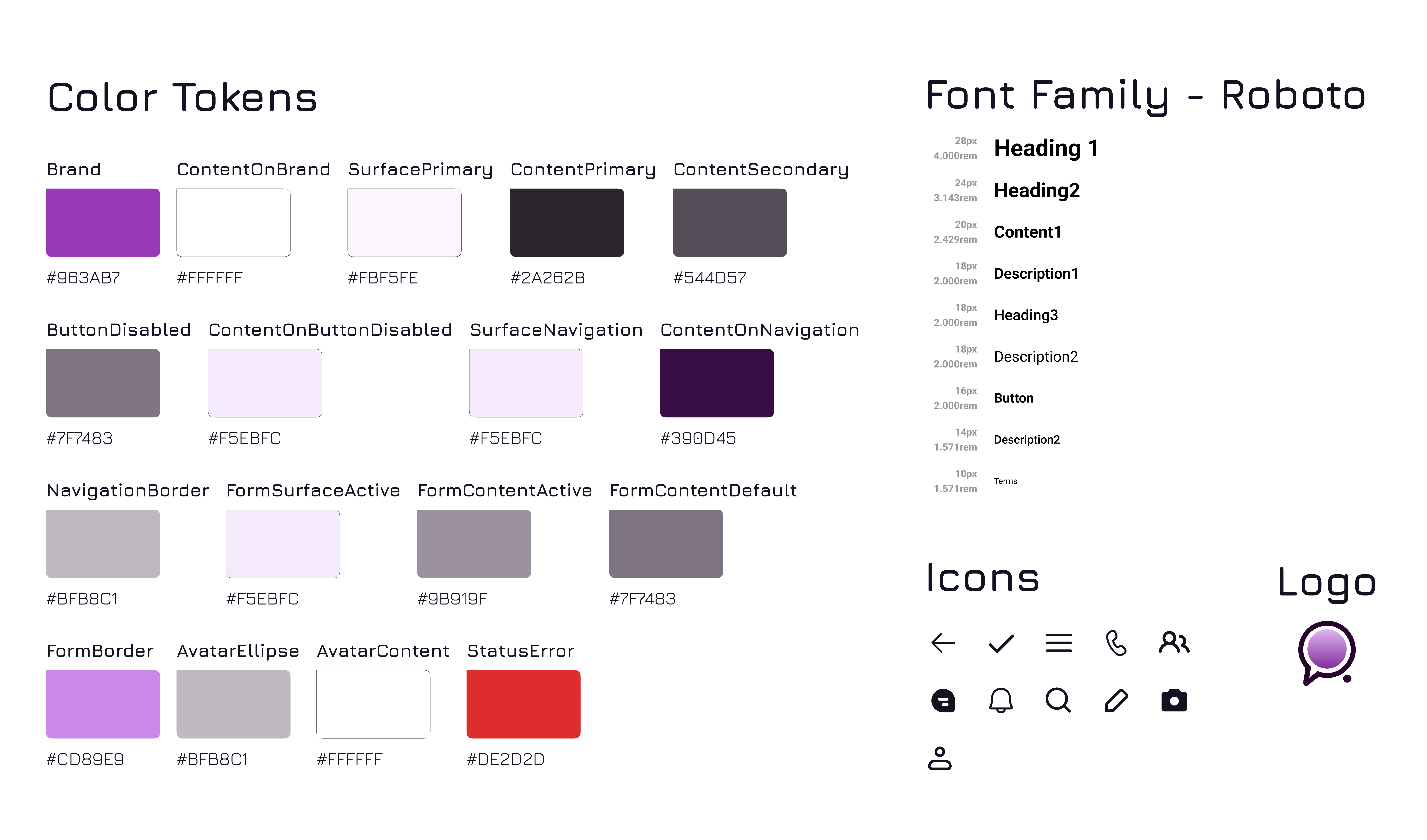
To maintain consistency and visual appeal throughout the app, I developed a comprehensive UI kit. This kit includes our logo, a set of intuitive icons, carefully selected font, and a well-defined color palette. The color palette features tokens such as Brand (purple), SurfacePrimary, and ContentPrimary, ensuring a cohesive look and feel. By standardizing these design elements, the UI kit helps streamline the development process and ensures a polished, professional appearance across all screens and interactions. This cohesive design system is key to creating an engaging and user-friendly app experience.

Prototype and Testing
To validate the design and functionality of the registration process, I developed an interactive prototype. This prototype allowed users to experience the full flow from entering their mobile number to completing the OTP verification. I conducted several rounds of usability testing, gathering feedback to identify pain points and areas for improvement. The testing phase was crucial in refining the user experience, ensuring that each step was intuitive and easy to navigate.
Key Highlights
- User-Centric Design: Focused on creating an intuitive and straightforward registration process that minimizes user effort and frustration.
- Efficient Verification: Implemented a quick and secure OTP verification system to enhance user confidence and streamline the onboarding experience.
- Consistent Visuals: Maintained a cohesive look and feel across the app using the standardized UI kit, ensuring a polished and professional appearance.
Final Design
The final design of the registration flow incorporates all the feedback and insights gathered during the testing phase. It features a clean and modern interface with clear instructions and easy navigation. The use of the UI kit ensures consistency in design elements. This comprehensive and user-friendly registration process sets a positive tone for new users, encouraging them to continue exploring and engaging with the app.
Takeaways and Next Steps
This project highlighted the importance of a user-centric approach in designing an effective registration process. By focusing on user needs and pain points, we created an intuitive and streamlined onboarding experience. The iterative design and testing process ensured that each element of the registration flow was optimized for ease of use and efficiency. The result is a registration experience that not only meets user expectations but also sets a positive foundation for their interaction with the app. By staying committed to user-focused design and continuous improvement, we can ensure that the registration process remains a strong and welcoming entry point to our app.
